
The following interview was conducted by Byron Collins, from Collins Epic Wargames in regards to the artwork in the Frontline General: Spearpoint 1943 expansion currently on Kickstarter:
Below is an interview with this game’s artist from Bonn, Germany, Marc von Martial. You’ll also get to see some more game artwork previews supporting the interview. Marc runs cogwheeldesigns and he did all of the artwork for the Spearpoint 1943 Map Expansion for us. By supporting this project, you’re also supporting this hard-working and talented artist.
1. You nailed the detail-rich artwork of this expansion. can you describe how you approached this project’s requirements and goals?
Happy to hear I nailed it. I always start with collecting a lot of reference material. Photos from the area in question, photos from houses, foliage, landscape etc. Since the plot for the “summer side” of the map was southern Italy it was quite helpful that I had been to Sicily (which I totally love btw.) just a few months before you approached me to paint the maps. I always shoot a lot of reference textures and photos when I’m traveling. A lot from the Sicily trip actually made it into this artwork. Mud and thawing snow, as seen on the “winter side” is never a problem for me, I know that from Germany.

Typical Line of Sight Markup as provided to the artist. Markups like these were done for each Tile in the design phase to define the very important “highlighted edges” which affect Line of Sight in-game.
2. Do you prefer working at this level of detail?
Absolutely! I love detail. It is hard to stop for me sometimes and one really needs to be careful to not drown in detail work for games. As an artist you could go on and on, but of course you also have to watch the budget too! The ideas usually grow the deeper I dive into the project. Adding little bits here and there. Things that might not pop out initially. At certain points I really get very immersed in the artwork, it is like I would be playing the game already. The hours rush by then. I strongly believe that games that feature a good portion of graphical immersion to the gamer have a way better replayability factor. Of course that’s only one part that makes for replayability besides an actual great game design itself.
3. Can you describe how you created one of the village buildings then added damage to represent its destroyed state (side B)?
I start constructing and painting the intact houses first. The Photoshop files are rather complex. A lot of layers, masks, layer effects. That allows me to adjust the damage for each segment of the house pretty efficiently. I then add the details that would not be there on the intact building. Like the roofs’ wood beams, scattered bricks etc.
4. What was your favorite aspect of the project and single favorite resulting art piece?
My fav aspect was the level of detail I was allowed and at the same time the huge size of the map and tiles. I’m very happy with the “winter” side of the map. And I like the church too.

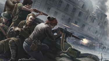
Portion of the Italian Defensive Line Map.
5. The maps are gorgeous. Can you talk a bit about how you approached them?
Thank you! After the initial “getting inspired” phase, I start choosing textures from my own photo stock or licensed and free ones. I play around blending them and adjusting them to find a set of 3-5 base texture layers. Then I start developing a few custom brushes that help me to break the textures artificial (and sometimes not even fitting) looks and blend them together, to set the base landscape look. Over this base landscape I paint over with some more custom brushes to lay in ground details like gravel, scattered stones, flowers etc. etc. This is an ongoing process that can some time. When I’m happy with the basics I start shaping the landscape with lights and shadows.
6. Regarding the counters, you had a lot of free choice with how to represent various things. What was the most challenging counter to create?
I always struggle with “smoke“ counters. Not sure why, but they usually give me headaches.
7. The box art is a colorized WWII black and white original. Can you discuss that process of adding color to give the photo more life?
Coloring b/w photos is actually a pretty “easy“ thing if you know your way around in digital imaging apps. Having done this a couple of times I have a palette of colors I often use for recoloring skin tones, foliage, uniforms etc. I usually start painting over the b/w image with the color layer set to “overlay“ in Photoshop. When I’m done I adjust layer blend modes and hue/saturation to blend everything better. Finally I Gaussian blur the color layers, merge them and adjust with adjustment curves. Depending on the base b/w photo is sometimes needed to adjust that one locally with some curves.

Tracking counter samples.
8. Are you planning to tweak any of the final art prior to production? If so, how?
Yes, right now I add some more detail to the houses and give the roof tops more variation. Simple things that have a big effect. I will most probably give the maps another fine tune pass also. It is always good to let the “final“ artwork rest for a few days, if not weeks and then go over them again with a fresh look at it.
9. What final thoughts would you like to add about this job?
I love the sheer size of the maps and tiles. As an artist it is always great to work on projects that are getting printed, and so printed huge is even better. It was also interesting to get the LOS feature to work on the cards, I never had worked on a project with this kind of LOS before. At first I was kind of confused about the whole set up, but we worked it out. I would like to thank you for the opportunity to have a go at such a detail level. It came at the right time.
10. What other projects are you currently involved with?
I’m working on a few titles for Matrix Games and Slitherine, some things for Lock n’ Load Publishing and most probably you! Apart from that I work a lot on my photography blog, developing my photo skills and the usual graphic design stuff for a handful of local clients.
Thanks Marc!

House ruin.