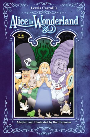
Publisher: Dark Horse Comics
Writer: Rod Espinosa
Artist: Rod Espinosa
Cover Art: Rod Espinosa
Pages: 128
Format: Hardcover
Retail Price: $19.99
Dark Horse synopsis:
The curious Alice follows a flustered white rabbit to a magical land of talking animals, evil queens, and enough riddles to strain any logically inclined brain.
It’s all here: a hookah-smoking caterpillar, a mad hatter, potions to drink, cookies to eat, and a Cheshire cat. Alice discovers that Wonderland may be a fascinating place to visit, but you don’t want to live there . . .
“Another adaptation of Lewis Carroll’s Alice in Wonderland?” you may be thinking. I’m sure with all of the like-models out there you may be quick to assume that this is just another same ol’ Alice. From my standpoint, I’m always intrigued to experience titles away from the ‘Mickey Mouse Organization’ perspective (if you grew up watching it like me), especially the art side of it where this kind of story can either ‘make or break’ an adaptation. Being an artist myself, I am always open to seeing how the illustrator uses the art and panels to draw you in to a comic and story, in this case they took the magna/anime route which gives it a new twist. Being a fan of the story itself and having experienced most of the variances thrown out there, I can give you a good perspective of this piece. Knowing this is a Dark Horse comic, and adapted by an Eisner-nominated creator/illustrator, the positive foundation is there, let’s see where it goes.
This hardback beholds the same events and has all of the characters you have come to know from Carrolls novel. The Caterpillar, Cheshire Cat, Mad Hatter, and of course the singular force that all of Wonderland fears, The Queen of Hearts. Espinosa made a great effort to capitalize on these prominent characters and scenes to capture “the magic” if you will. Knowing that this story is double my age alone, I can be safe to assume that everyone has either read this, seen the movies, or played the games enough to know the story. This way I can give you a solid review on the adaptation itself and focus more on the art and comic of it, which will save you the time of going through the whole story you may already know.
Alice: Being that she is the main character, Espinosa did a good job on bringing Alice to life. Most of the time the colors and situations remained pretty simplistic and to the point. He really used the magna/anime style for her unique face expressions, which gave continuity to each situation. Overall he pulled off the ‘curiosity killed the cat’ mentality, and innocence which you should expect from Alice.
The Caterpillar: As Alice is blasted by some smoke of indifference, she is quickly inquired by hookah smoking Catapiller, with John Lennon type glasses, with a Paul Shaffer kind of face (See: Bald guy from David Letterman) . Artistically I was impressed, the smoke was hazy and gradient-ish yet subtle, the thought or conversation bubbles occasionally changed colors, along with the font, where they also changed with intensity and size. The panels themselves throughout the scene were asymmetrical and wavy to add to that ‘psychedelic’ and ‘floating on clouds’ sense I always hope to expect from this part of the story.
Cheshire Cat: This was probably my most disappointing adaptation by Espinosa. He was less enchanting than I had hoped he would be. However, the art of the panels was still consistent to his type of scene. Hazy, mysterious even. The artistic portrayal automatically gave me the impression that we was more a “Scar from ‘The Lion King” kind of cat more than The Cheshire we all know.
Mad Hatter: When you first see him, you cannot tell me you don’t see Jay Leno with a TopHat on! It almost prompted me to research if he had a special ‘face’ appearance for this comic. Even through the initial appearance shock, it was very hard to see this Mad Hatter in his true form and definition. He came off as more jolly rather than nervous or….well……mad. Maybe it’s my bias knowing where ‘Mad Hatter” came from. I’ll briefly define for you: Hatters were mad because they used mercury in the production of curing felt hats, where handling mercury (a liquid metal which soaks into the skin quickly) will cause madness after long exposure, which gives birth to the phrase “as mad as a hatter”. There you go so you may see my point. He still did do a good job irritating Alice though.
Now that you have an overview of the characters, I personally enjoyed this variance of a classic because I am a fan of “Through the looking glass”. However there were many inconsistencies and my own bias mind from previous models of Alice that get in the way of capturing that “magic”. From an artist/designer, comic lover standpoint, I loved the panel structure being altered through each event in transition. From the beginning they were all perfect, crisp and innocent…undisturbed. Then she falls into wonderland where the panels begin to appear altered, overlapping, and actually help define the actions and events to keep you engaged in the story. Right up to the very end when she comes back to reality, ending in an initial innocent box form, coming back full circle to a close. For a fan of ‘Alice in Wonderland’ or ‘Through the Looking Glass’, this rendition might make you indifferent in some ways, but content in others. Which is honestly where I’m at right now. For someone who has never read ‘Alice in Wonderland’ I was curious what the outcome would be and I applaud the effort by Dark Horse to take a shot at this classic. However, for the traditional fan (like I am) this may leave you torn.