
Here’s the lowdown on all the new card layout changes from Aaron Forsythe:
1) The font
Since its inception, Magic has used off-the-shelf fonts on its cards. As a brand, we feel that we’ll be better served by having our own unique proprietary font—something with a little edge and character that is still very readable.
In general, we liked the heaviness and shape of the “Matrix Bold” font we’d been using previously, so there are a lot of similarities between the old font and the new, named “Beleren,” which should alleviate any jarring feeling when you mix the two together in decks.
2) The holofoil stamp
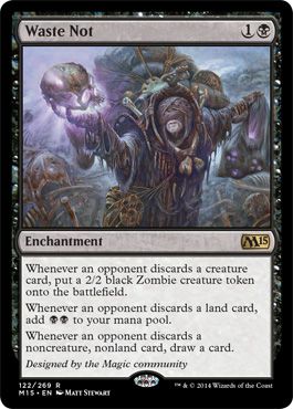
You’ll notice a little silver oval in the bottom center of Waste Not. That’s a new unique holofoil stamp that we’re applying to all rares and mythic rares going forward. This stamp makes those cards feel more special, as well as guarantees authenticity.
Commons, uncommons, and basic lands will not feature this stamp.
3) The collector info
In the lower left of the card is a series of letters and numbers that indicate the card’s collector number (122/269), rarity (R), set (M15), and language (EN). The little dot between the set and the language will be a star on premium cards, so just about everything you’d ever need to know about a card’s edition is in one easy-to-read place.
Making the bottom of each card black to accommodate this information was not an easy decision, and may be the most disconcerting part of this frame update, but it was done with the best of intentions. This information is machine-readable by recognition software at our production plants. It will help eliminate the rare packaging error, like cards sneaking into the wrong expansion’s boosters.
4) Decreased border size
In order to fit all this cool new stuff on the cards, we’ve reduced the width of the black border by almost a millimeter all the way around. This reclaimed real estate allows us to have slightly bigger art and text boxes as well.
5) The designer credit
You’ll notice that we gave you all credit for making this card in the place normally occupied by flavor text—”Designed by the Magic community.” This is the first time we’ve ever given credit for a specific card design on the card itself, and it’s you! You should be very proud! While every card going forward won’t feature a designer credit (kinda sad, really), there are a handful of others inMagic 2015, specifically, that will. (You’ll have to wait on those details! It’s cool, I promise!)

- Doctors and Daleks Player’s Guide Reviewed - May 10, 2024
- Tales of the Valiant Player’s Guide and Monster Vault are Out in PDF - May 10, 2024
- Cults of RuneQuest: The Lunar Way Arrives May 22nd - May 10, 2024