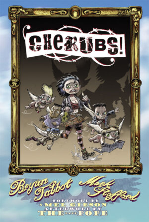
Publisher: Dark Horse Comics
Writer: Bryan Talbot
Artist: Mark Stafford
Cover Art: Mark Stafford
Pages: 192
Format: B&W; Hard Cover, 6″ x 9″
Retail Price: $19.99
Dark Horse synopsis: Falsely accused of heaven’s first homicide, five churlish cherubim escape to New York in pursuit of the renegade archangel Abbadon on the eve of the Apocalypse! Befriended by exotic-dancer Mary and chased by unstoppable Seraphim terminators, the Cherubs alone stand against hell’s hordes as Satan prepares to make war, not love!
***
The easiest way to break down this review is with the old, “I’ve got some good news, and I’ve got some bad news” shtick. First, the bad news:
When the topic of religion is tackled in fiction, authors traditionally have to apply a pseudo-reverent sensibility to the material, or risk alienation of any potential adherents to the faith(s) being fictionalized. “Cherubs” tackles the titular beings from Biblical reference, but with a huge twist:
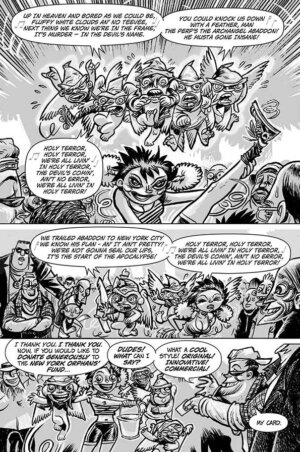
On the point of reverence, Cherubs plays fast and loose with Biblical source material in the same way many other stories have (“Supernatural”, both the comic and the show, and the films “Dogma” and “Stigmata” all come to mind). However, it uses the concepts of the ethereal beings more as a jumping-off point for a paint-by-number, fish-out-of-water, [hyphenated-cliche-descriptor-here] hero troupe story, rife with the most basic tropes most readers have seen used in abundance. There’s the “we don’t have this back home” intertwined with bodily functions. There’s the “rather reign in Hell than serve in Heaven” treacherous bad guy, literally, played by Abaddon (he even uses this same quote in a turn of completely inessential exposition). There’s the “it wasn’t me – it was the One-Armed Man!” played by the titular characters, running from both the “good guys” and the “bad guys”. There’s the pop culture references (omitted here to avoid spoiling the sight gags). This trope list goes on, whereas I will spare the reader of this review that expense.
Now, the good news:
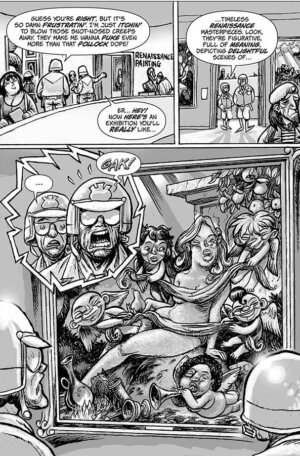
As for the artwork, there are some pretty good visual jokes thrown into the background. One thing I can always appreciate is the evidence of an artist who cares about the details. When my eye wanders off of the primary characters in the frame, I am treated to some clever little puns: a woman reading a book called “Women Are from Venus, Other Women Are from Venus”; a beer called “Blind Toad” with a subtle logo of a toad wearing sunglasses; a guy wearing a shirt that says, “SORRY MA”, and so on. There is even a nod to Bosch and Giger in there! Someone knows what they’re talking about.
The character design is solid, with good line work, original forms and imaginative simplicity. The facial expressions, while at times redundant, are effective at conveying emotion. We see a good range demonstrated in the early going of this work. This brings me to a revelation about this whole comic: since the artist is proficient in emotive exposition, the storytelling need not be so expository. Personally, I would rather see images used to portray surprise, wonder, fear, confusion, etc. than have the characters reminding me that “in Heaven, we don’t poop”. In simplest terms, the artwork is substantially better than the dialogue. Once the writers get more public feedback on this work, I expect to see any of their possible future collaborations lean much more heavily upon its artistic storytelling than upon words.
- The Most Successful Video Game Franchises - Jun 28, 2013
- Angels, Devils and Poop Jokes: A Review of ‘Cherubs’ TPB - Jan 23, 2013


